
The World Ablaze
Wild, Wild, Wildfire Worldwide Trends


Thanks for reading or listening! You can support Foreign Figures by liking, sharing, buying me a coffee, or becoming a free or paid subscriber.
In my previous newsletter, I said I’d take a look at wildfires this week. Now is the time to deliver.
I’m sure you’ve seen plenty of headlines about wildfires lately. A couple of weeks ago, here in Columbus, OH, we were treated to hazy skies, poor air quality, and an ever present smell of sulfur as the wind carried the smoke from intense Canadian wildfires south of the border. Currently, Europe is suffering one of the most destructive wildfire seasons on record. Between France and Spain, hundreds of thousands of people have been displaced due to evacuation orders.
For today’s newsletter, I want to better understand global trends in wildfires. Are they becoming worse? Are the fires in places like Canada, France, and Spain uniquely bad this year relative to the rest of the world?
To answer these questions, I decided to download some global data on wildfires prepared by Our World in Data, which they obtained from the Global Wildfire Information System. This data covers the weekly cumulative number of hectares burned from wildfires by year and country from 2012 to, as of my writing, week 29 (mid-July) of 2026. If you don’t know, a hectare is a 100-by-100 square meter area more than twice the size of an acre. The data is based on satellite imagery, so it’s quality isn’t perfect. It also doesn’t distinguish between forest fires and burning agricultural land or grasslands. Hence why I use the term “wildfire” instead of “forest fire” throughout.
Below I show you what I found, and then I wrap up with a meditation on the attention we humans today give to the global versus the local compared to the pre-digital past.
Trends in Wildfires
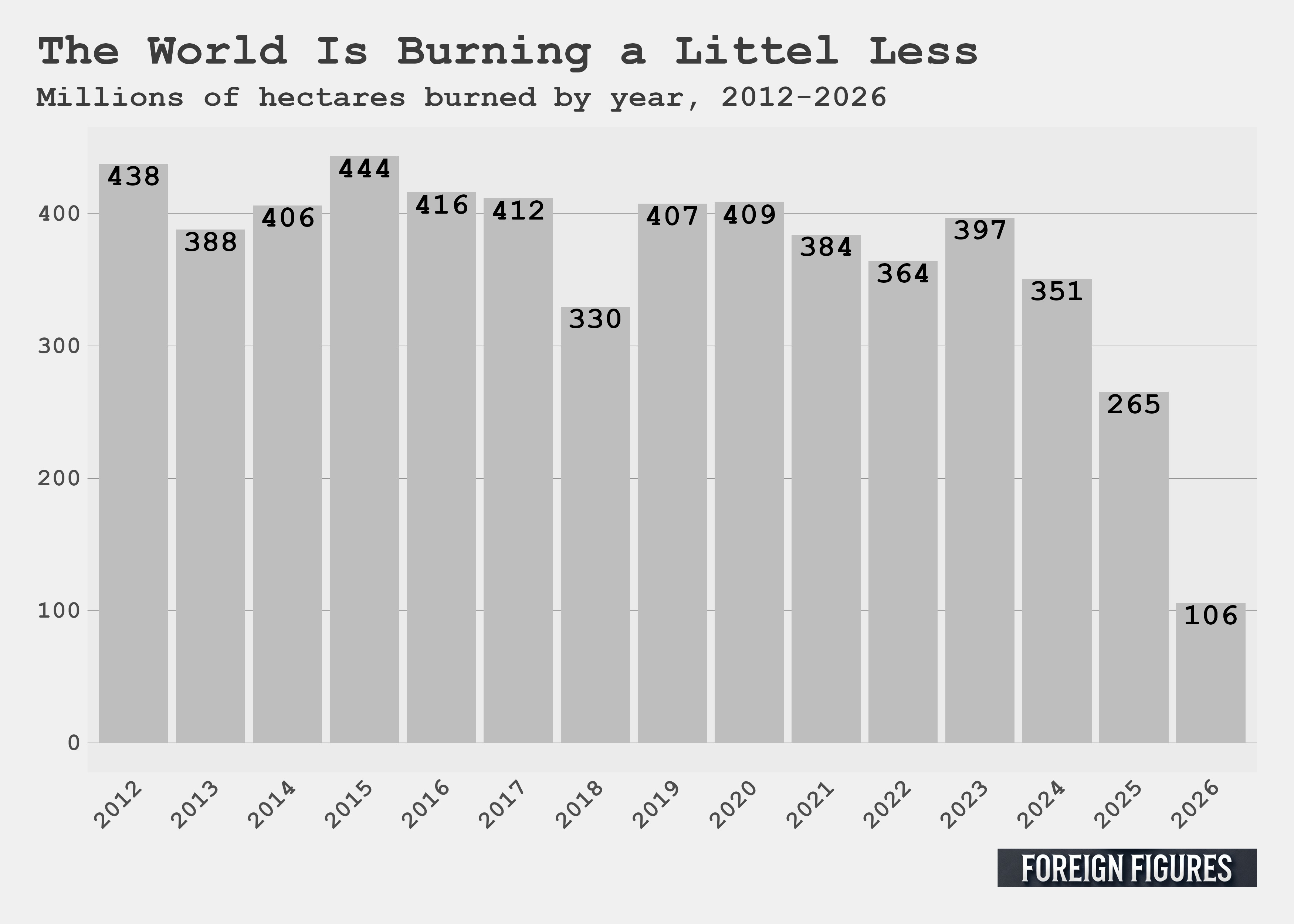
I first decided to check the yearly frequency of hectares burned. You can see the data in the figure below. To my surprise, the frequency has a downward trajectory, particularly in the last few years. The current year isn’t over yet, but from my vantage point, the rate seems poised to be lower than the yearly average in the previous decade. The worst years in the data were 2012 and 2015, which saw 438 and 444 million hectares burned in wildfires globally. Last year, 265 million hectares burned. As of mid-July this year, 106 million hectares have burned. Based on the news headlines, this is the opposite of the trend I expected to see. I looked into it, and it seems declining shrubland, grassland, and savanna burning in Africa is the culprit.
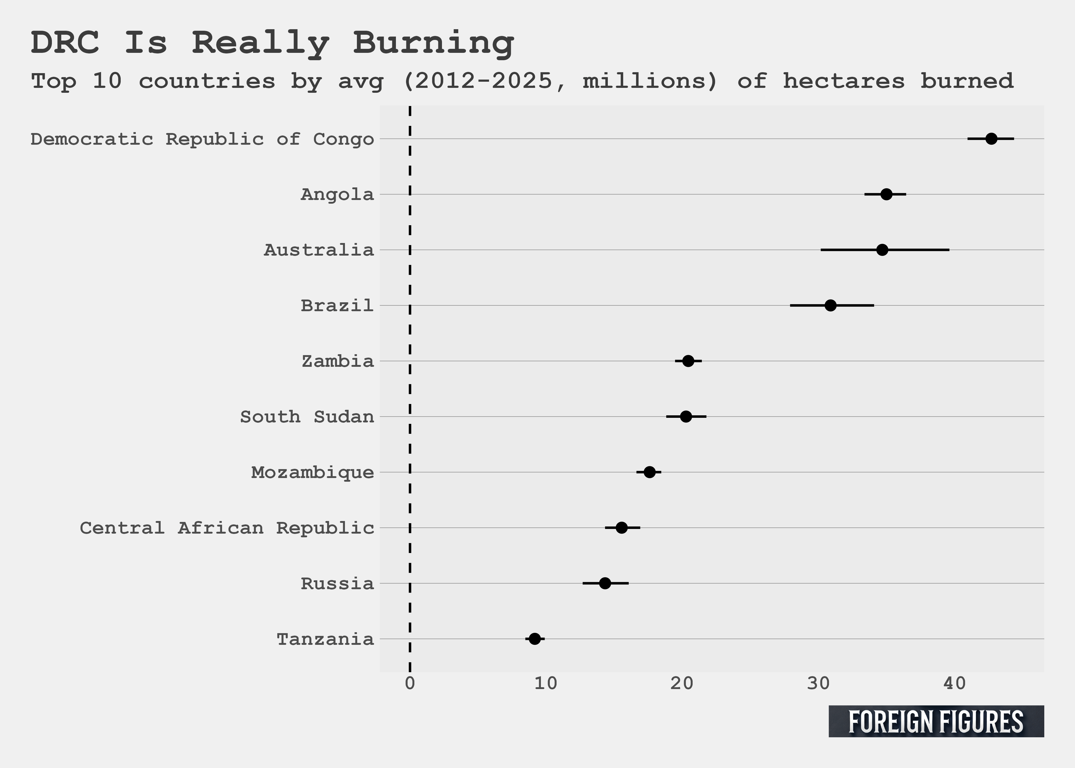
I next put together a top 10 list of worst burners by calculating the average yearly burned hectares rate for each country in the data, excluding 2026 since the year isn’t over yet. I plotted the top 10 in the figure below. The Democratic Republic of the Congo is at the top of the list with an average yearly burn rate of over 40 million hectares from 2012 to 2025. Australia is the only industrialized Western country on the list, suffering over 30 million burned hectares per year. Russia and Tanzania round out the bottom of the list, the former witnessing less than 15 million hectares burned per year, and the latter less than 10 million.
You likely noticed that Canada, France, and Spain were absent from the list, yet all three countries are dominating headlines. Could this record-setting year have moved them up into the top 10 burners list for 2026?
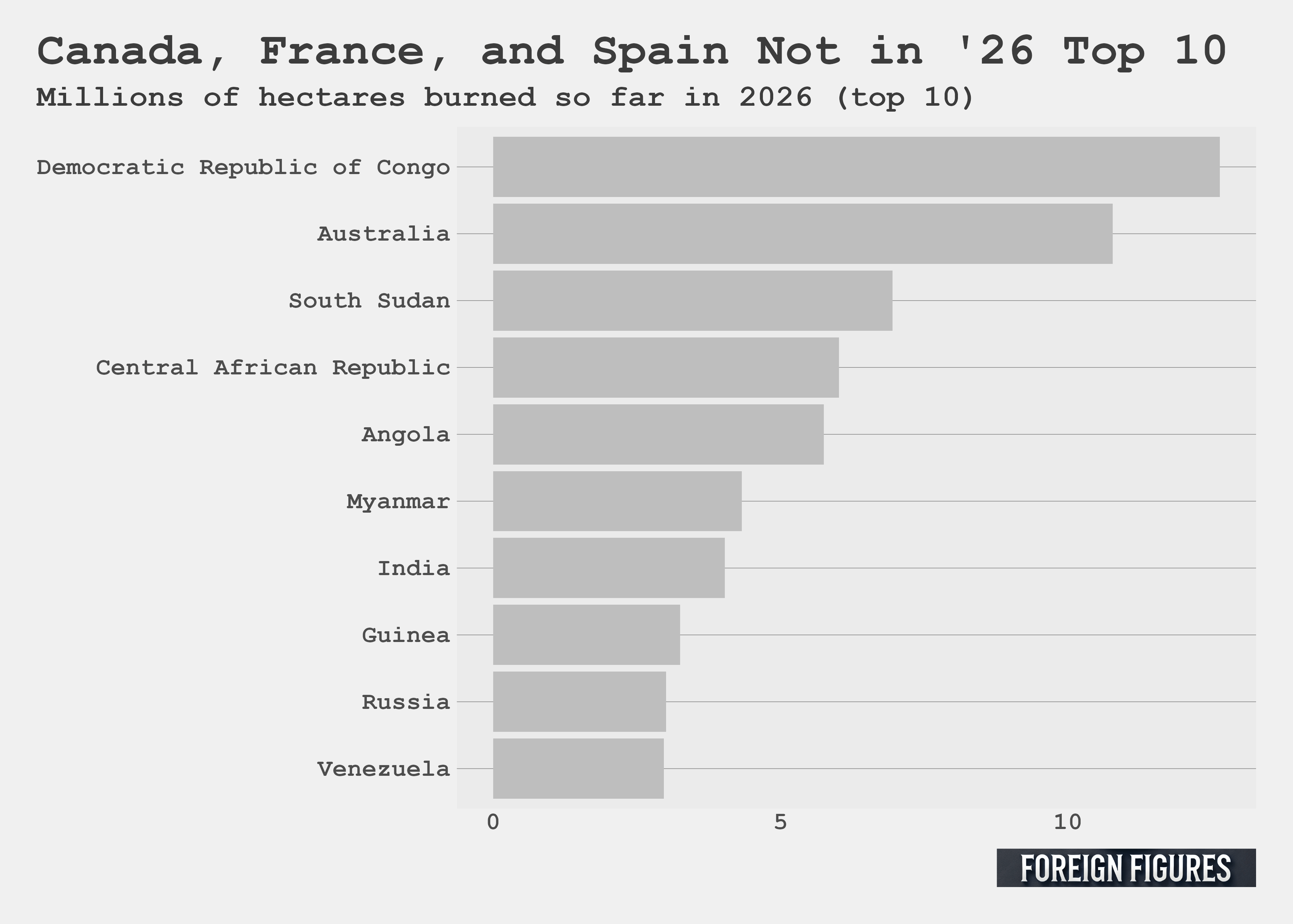
According to the data, no. The next figure shows the hectares burned so far in 2026 by country. Unlucky DRC tops the list again, followed by Australia. There are a few different entries, but Russia is still there, and a couple others. So where do the Canadians, French, and Spanish fall?
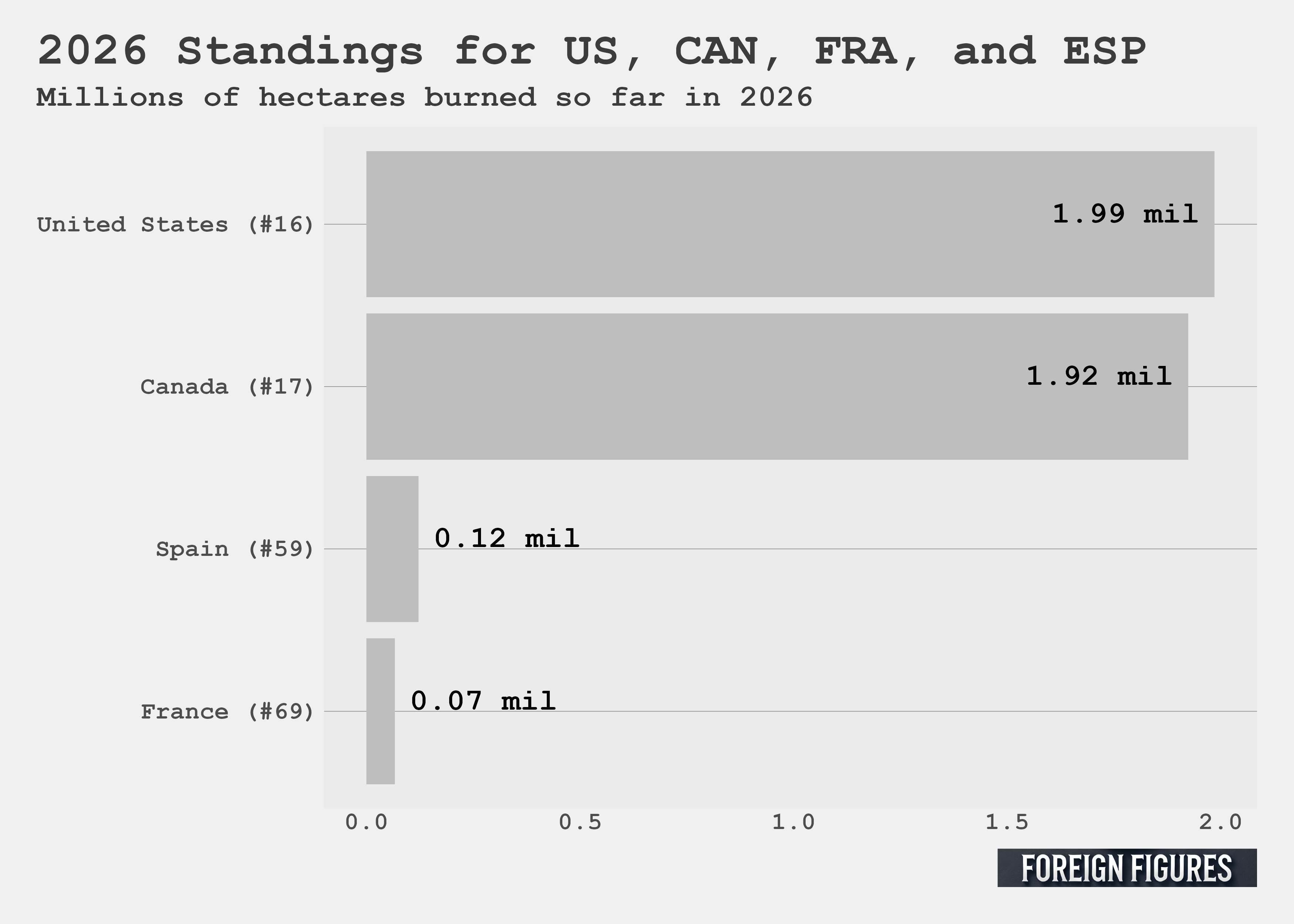
As you can see in the figure below, Canada is in 17th place, Spain in 59th, and France in 69th. I added the US to the list, too. It’s in 16th place, just ahead of Canada. In order, the US so far has had 1.99 million hectares of land burned, Canada has had 1.92 million burned, Spain has had 120,000 burned, and France has had 70,000 burned.
So Canada, France, and Spain aren’t in the top 10, but have they moved up in rankings over time? If so, this would confirm that they are, indeed, suffering relatively more from wildfires than in years past.
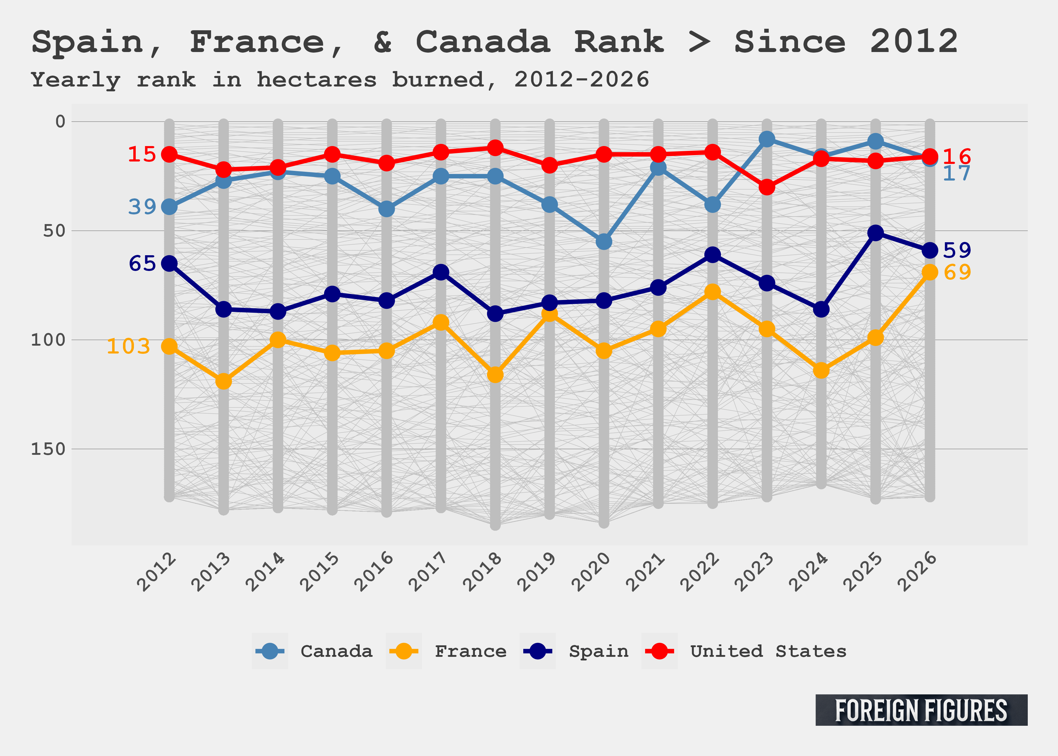
The next plot answers this question. It’s a bump plot that shows changes in yearly wildfire damage rankings. I highlighted Canada, France, Spain, and the US. All other country rankings are colored gray and in the background. The Canadians, French, and Spanish have all moved up in the rankings. In 2012, Canada was in 39th place, well behind its current position in 17th place. Spain was in 65th place, just a bit behind its current position of 59th place. France moved up the list considerably. In 2012 it was in 103rd place, far behind its current position of 69th. In comparison, the US rank has remained quite stable. In 2012 it was in 15th place, just one position ahead of where it is now.
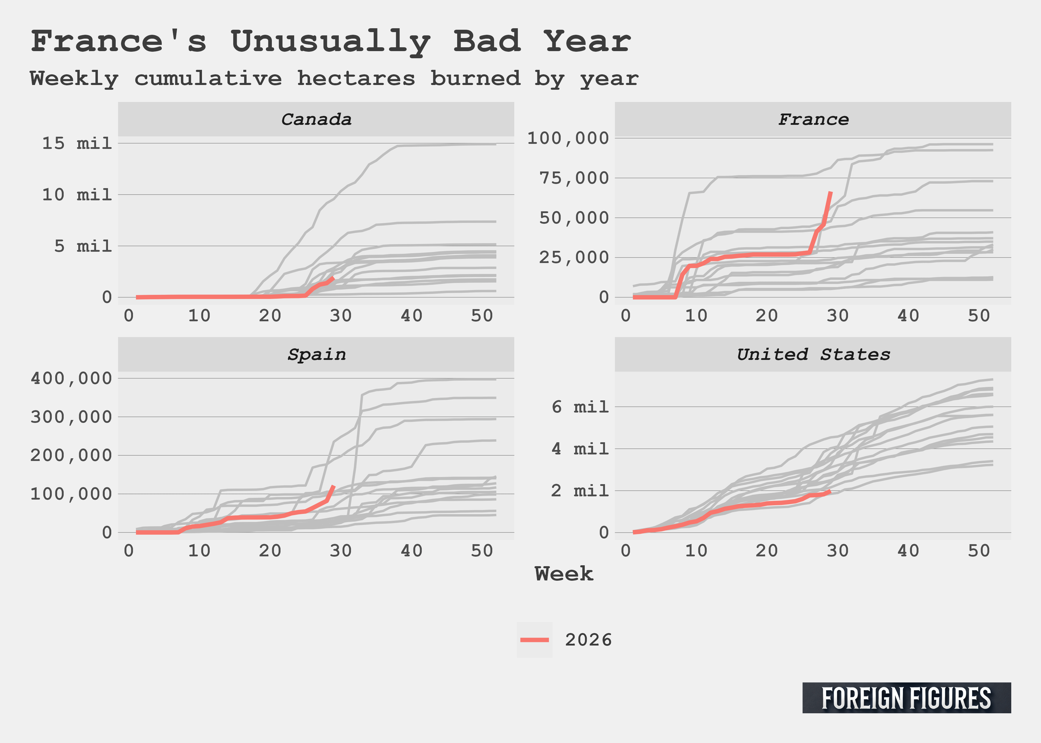
The massive upward movement in the rankings for the French makes a lot of sense when you look at the data on a weekly basis. Check out the next plot below. I went back to the raw, disaggregated data and plotted the cumulative hectares burned per week for each year. I highlighted 2026 values in red. France is well ahead of where it would normally be in a given year. Only one year saw more hectares burned by this point. I checked the data, and it was 2019. Spain is also a ahead of where it would normally be, while Canada is having an average year and the US a below average one as of mid-July.
There’s one final thing I want to address before I wrap up. I noticed that the numbers I have from the Global Wildfire Information System by way of Our World in Data aren’t identical to the values provided in recent reporting by the New York Times, who drew their data from the European Forest Fire Information System. As you can see in the figure below, they have France’s 2026 mid-July cumulative total well ahead of previous years. At first, I didn’t know what to make of this. I worried I made a mistake, but I checked my totals against those reported by Our World in Data’s dashboard, and my numbers line up.
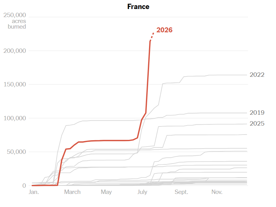
I suppose this is a good time to remind my dear readers that collecting data isn’t easy and it involves unforeseeable judgment calls. Depending on the source you use, France is either having a record setting year, or not quite. It could be that the Times went with the data that made for the flashier headline. Record setting sounds worse than almost record setting. As best I can tell, the Times’ data undercounts total land burned for previous years, but somehow seems to overcount land burned so far this year. Their figures are in acres rather than hectares, so that can be hard to see. If you don’t know the conversion off the top of your head, a hectare is 2.47 acres and some change. By my reckoning, that means the Times’ total for 2019 in the figure above undershoots my 2019 total by about 50%. Yet my total for 2026 undershoots theirs by about 30%. I noticed a similar pattern from looking at their data visualization for Spain. Clearly, some data filtering or different counting rules are at work.
I was scratching my head trying to sort this out. The Times has a GitHub page, but their forest fire analysis, as of my writing, isn’t there, so that wasn’t helpful. Then, Hannah Ritchie, who is a deputy editor at Our World in Data, among other things, managed to answer all my questions in a post of hers last week. She beat me to the punch writing about wildfires, too. You should check out her analysis, which is comprehensive. When I saw hers drop as I was about to finish mine, I had the same feeling that a kid might have who set up their booth at a science fair showing off how they grew rock crystals only to discover that the person in the booth next to them crew a crystal palace. Quite disheartening, but no reason to slunk home.
At any rate, it seems that the main difference between the data I and the Times looked at is that theirs tries to capture only forest fires. This would explain why their numbers are generally lower, though it still seems odd to me that their numbers for France are higher (as of my writing).
This discovery left me wondering which way of looking at the data is best. Forest fires are bad, but burning grasslands, savannas, and agricultural land seems worth including. That is, wildfires in general seem like the relevant category beyond forest fires alone.
However you slice it, France and Spain currently suffer under one of the worst wildfire seasons in recent memory. To those displaced, the question of whether this year is the worst or among the worst must feel like splitting hairs.
Lessons Learned
Data discrepancies aside, my biggest takeaway from looking at the data is that much more of the world is ablaze this year, and on a regular basis, than I realized. My only exposure to information about wildfires comes from the news, and the news, on this count, is parochial.
For good reason.
If my own house burned down, that would concern me far more than the wildfires in Europe currently do. That may seem selfish, but I think it’s just part of being human. I don’t think we as a species are wired to accept the onslaught of troubling news from far-flung lands in the large volumes that define the digital age. We’re built for local community, or the tribe if you prefer, and for handling the immediate concerns of our group. If I were alive 200 years ago and lived where I currently do, I would have no inkling of wildfires in Europe, or in Canada, or west of the Rockies. At the same time, I would know far more about the affairs of my neighbors, my town, and my county than I currently do in 2026.
Uneven global coverage of wildfires in my newsfeed is in some ways a product of the ancient human tendency to care about the immediate and the local, yet it simultaneously serves as a reminder of just how much digital media compel me, and you, to trade concern for local affairs for abstract distant ones. What, after all, is this newsletter about? Much of the study of international relations and global politics deals with the abstract and the distant.
Awareness of the world beyond my five senses is good, and I have much more of that today than a version of me would have had 200 years ago. However, I, and perhaps you, have exchanged too much focus on the local for the global.
I didn’t intend to land here as I wrap up, but such is the nature of writing.
Code for this post can be found here.
Thanks for reading or listening! You can support Foreign Figures by liking, sharing, buying me a coffee, or becoming a free or paid subscriber.