


Can We Predict Non-Peaceful Protests?
Yes, we can!

Thanks for reading or listening! If you enjoyed this post, you can show your support by liking and sharing, buying me a coffee, or subscribing!
The New York Times recently covered a story about violent protests in Kenya. You can read the piece (or just look up the details yourself) to get more of the specifics, but the gist is that Kenyans are facing some tough times. Economic frustrations, unemployment, and police brutality all are part of the story.
This case provides a great opportunity to use data to think more systematically and abstractly about the factors that propel a country down the path of mass violent protests. One of my favorite rationales for why we can learn a lot about a single case by looking at a broad range of cases comes from the famed political scientist Seymour Martin Lipset who said “a person who knows only one country knows no countries.”
This pithy axiom offers a powerful lesson: the best way to learn about the world is through comparisons. This is especially true if we want a better understanding of the behavior of countries, politicians, or citizens. How do we really know what details are important for explaining something as consequential as violent protests? Simple: by comparing many cases across time.
In today’s post, I wanted to see what I’d find by constructing a dataset of non-peaceful protest events and cross-referencing it with country-level data on factors that seem like they’d be relevant predictors.
Non-peaceful Protests
To measure non-peaceful protests, I turned to the ACLED database and pulled counts of all non-peaceful protests taking place at the country level and by year from 2020 to 2024. The category of “non-peaceful” comprises events that ACLED labels as “mob violence,” “violent demonstrations,” “protests with intervention,” those involving “excessive force against protesters.”
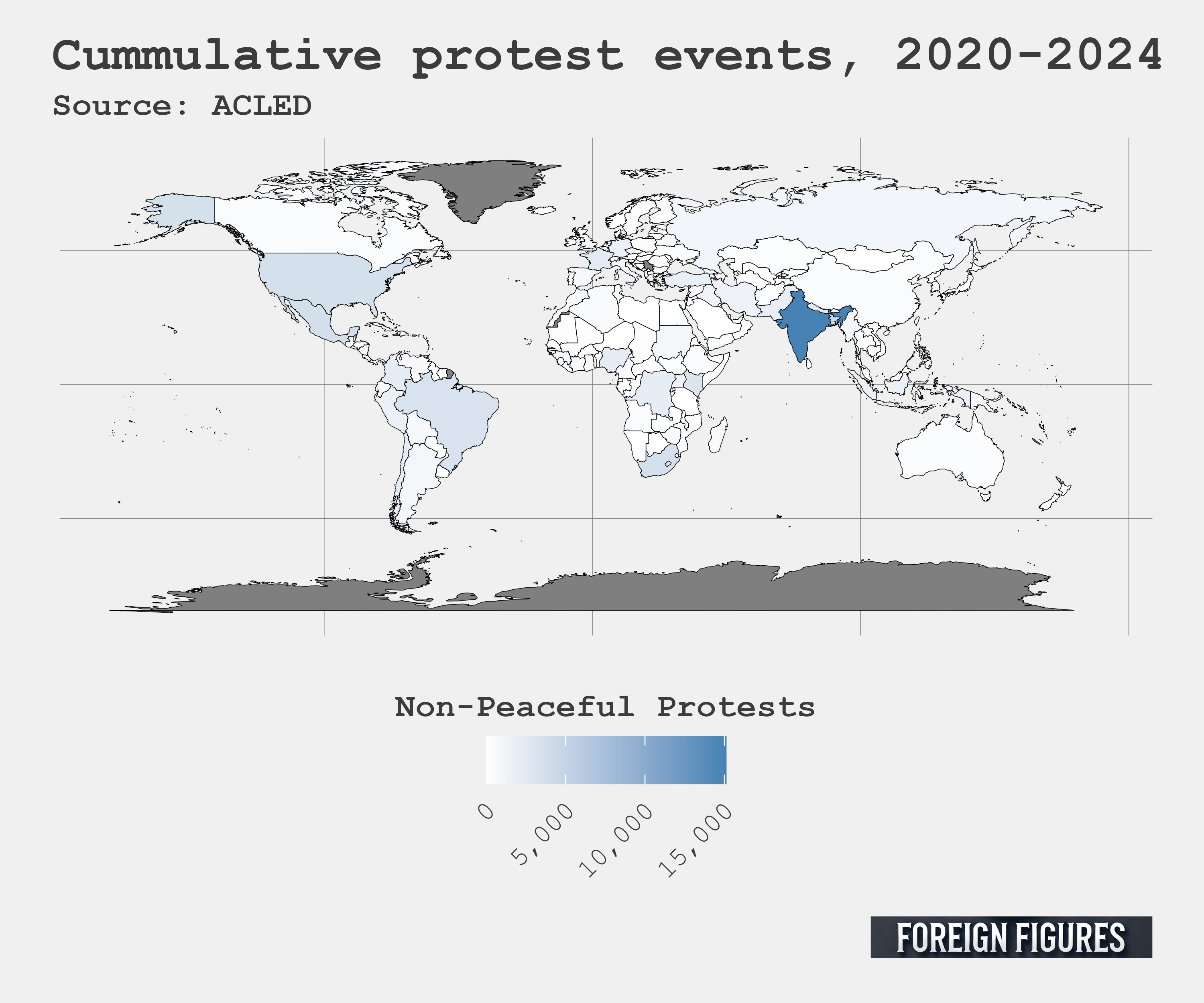
The below figure is a map of the world that summarizes the cumulative number of non-peaceful protests taking place in different countries over this period. India clearly stands out as especially prone to non-peaceful protests. From 2020 to 2024 it experienced nearly 15,000. Kenya, by comparison, experienced about a fifth as many (about 3,000).
What predicts protests?
To provide a better explanation for the variation in non-peaceful protests, I populated my dataset with some additional factors. From the Global Macro Database, I got measures of real GDP in U.S. dollars, population, the percent rate of inflation, and the percent unemployment rate. And from the Varieties of Democracy Project (V-dem), I got their workhorse measure of quality of democracy.
The justification for looking at these factors seems pretty clear to me. Countries with higher GDP probably have a more contented population, while those experiencing inflation or high unemployment probably have a more discontented population. Also, just by virtue of the law of large numbers, countries with larger populations can expect more protests of any sort because, well, there are more people. Finally, democracy captures the ability of citizens to have their voice heard. This one could be a double-edged sword. On the one hand, people in non-democracies might have more reason to protest — they want to stand up to a repressive regime and all that jazz. On the other hand, it’s a lot easier to protest in a democracy where there are fewer restrictions on mass gatherings and demonstrations. Simply by allowing more protests in general, democracies might be the most prone to non-peaceful protests as well.
Results
Alright, so what did I find? The below figure is called a “coefficient plot.” It shows estimates for different predictors included in a regression model. Because protest events are counts, I thought it’d be helpful to use a kind of model specifically designed for predicting things that are counts — a psuedo-Poisson model. The “psuedo” part of the name just means that I’m using a version of the model that makes no assumptions about unexplained noise in the data, which removes some bias from the model estimates. There are a couple different ways you can present the estimates from this kind of model. In the below figure I opted to show the results as the percent change in predicted frequency. Little stars (*) next to reported values mean that the estimate is statistically significant.1

The results look about as I suspected. A country with double the population of another is predicted to experience 70% more non-peaceful protests, while a country with double the GDP of another is predicted to experience 15% fewer. Since I used the log base-2 transformation on these, in converting the estimates to percent changes it means you interpret the percent change per a doubling of the predictor. In short, more people equals more opportunity for protests, while a bigger economic pie equals less discontent. That tracks.
The results for inflation and unemployment are a bit surprising. Since I didn’t log-transform these factors, the interpretation is a bit different. A country with 1 percentage point more in inflation is predicted to experience no more or fewer protests than another country. Unemployment does predict an increase in protests, but the difference is marginal compared to that made by population and GDP. A country with 1 percentage point more unemployment than another is predicted to experience 2.7% more non-peaceful protests.
Democracy is interesting. The V-Dem measure of democracy runs from 0 to 1. The closer a country is to 1, the more it’s a strong democracy. The closer it is to 0, the more it’s a strong autocracy (or authoritarian regime). The results indicate that a strong democracy is predicted to experience nearly 335% more non-peaceful protests than a strong autocracy. This is consistent with the idea that people in democracies have greater ability to mobilize to express their discontent than those in autocracies. This doesn’t mean folks in autocracies have less to complain about — it’s just that it’s a lot harder to protest when facing harsh government suppression.
Finally, I rounded out the model with a measure of the global non-peaceful protest rate in a given year. I included this because I figured it might capture global fluctuations in discontent that fail to show up in the country-specific measures. It turns out that the global frequency does actually predict country-level protests — at least marginally. A doubling in global protests predicts a 87% increase in protests in a particular country. There’s a lot of uncertainty in this estimate, however, and it’s confidence interval just touches the vertical line at zero. So it falls just shy of conventional levels of statistical significance (for whatever that’s worth). Either this means expressions of discontent reverberate across the world, or it means COVID-19 sparked a global rise in protests, and this is just an artifact of that. I’m not really sure. It could be a bit of both.
Wrapping up
I think the results tell an interesting story. Consider the map of the world I used to show the distribution of non-peaceful protests across countries from 2020 to 2024. India experienced by far the most, but its neighbor, China, barely registered any. The predictive model I used provides a basis for explaining why. While both India and China have the largest populations in the world (well over a billion each), India scores much better on the V-Dem democracy scale, meaning there are fewer constraints on mass demonstrations. Chinese citizens also enjoy a much larger economic pie. China’s GDP was about 5 times larger than India’s in 2024. India does have a slightly lower unemployment rate than China (about 4% versus about 5%), but the model doesn’t predict that should make a sizable difference.
Alright, let me try to come full circle and bring this back to Kenya. One of the reasons I like looking at data rather than news headlines is that headlines offer a biased view of the world. They tell you when bad things happen, but they don’t tell you how often that bad thing happens or whether that bad thing is trending upward or downward, or whether that bad thing is common or rare in certain parts of the world compared to others.
Yes, the Kenyas of the world do suffer from some nasty political violence, like non-peaceful protests, but the greatest concentration of these events isn’t in the Kenyas of the world. It’s in the Indias — places where there are more people and fewer restraints on mass demonstrations. But economic hardship does play a role, too. The headlines about Kenya rightly point to disappointing economic growth as a factor contributing to unrest, and GDP has clear predictive power according to my statistical model.
Clearly, the best case scenario for a quiescent citizenry is to be a small country with a large GDP ruled by an autocratic regime. Unfortunately for would-be autocrats out there, these three factors rarely go together.
Code to replicate the analysis in this post can be found here.
Thanks for reading! If you enjoyed this post, you can show your support by liking and sharing, buying me a coffee, or subscribing!
Those with a technical background might be interested to know that I hacked my way to using the log-2 base for the Poisson model to help with model interpretation. You can check out the code I linked to at the bottom of the post to see how I did this.